This page describes an image Blackbody Radiation
Download File ( image 82.27 kB)
Download PDF File (PDF file 21.97 kB)
Diagram caption:
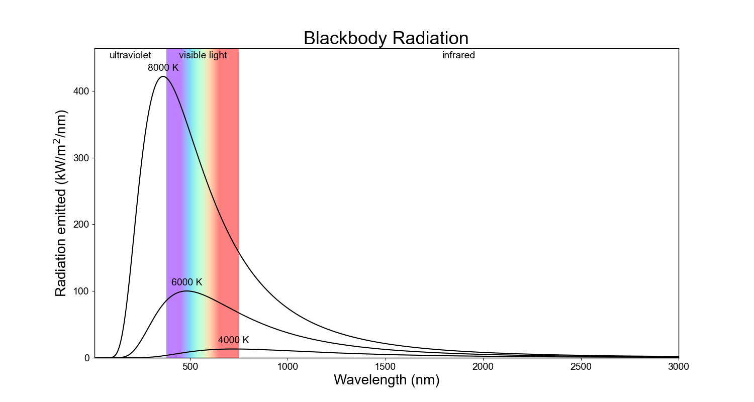
The curves of emitted radiation from blackbodies of different temperatures. The x-axis shows wavelength and the y-axis shows the amount of energy emitted every second by a square meter of the surface of that blackbody at each wavelength.
The hotter the body, the shorter the wavelength and the bluer the light it emits its maximum amount of energy at. Despite the coolest body in this plot peaking in red light, the other hotter bodies all emit more red light than the coolest body.
Diagram credit: IAU OAE/Niall Deacon.
Created with support from: OAE Main Office
Diagram license: Creative Commons Attribution 4.0 International (CC BY 4.0) Creative Commons Attribution 4.0 International (CC BY 4.0) icons
Related glossary terms:
Blackbody Radiation
, Electromagnetic Radiation
, Wavelength
Categories:
Physics
Want to make your own version of this diagram? Then have a look at the code that
produced this diagram on Github
You can also make your own version or translation of this diagram by adding adding text to a version of
this diagram with no text. Just download one of the following files:
Download Text-Free File ( image 48.29 kB)
Download Text-Free PDF File (PDF file 9.90 kB)
Linked Diagrams
Blackbody Radiation - UV CatastropheIn Other Languages
German: SchwarzkörperstrahlungBrazilian Portuguese: Radiação de corpo negro
Italian: Radiazione di corpo nero
French: Rayonnement du corps noir
Arabic: إشعاع الجسم الأسود
Marathi: कृष्णिका (ब्लॅकबॉडी) प्रारण
Traditional Chinese: 黑體輻射
Simplified Chinese: 黑体辐射
Spanish: Radiación de cuerpo negro
Persian: تابش جسم سیاه
Nepali: ब्ल्याक बडी रेडिएशन
The diagram captions presented on the OAE website were written, translated and reviewed by a collective effort from the OAE, the OAE Centers and Nodes, the OAE National Astronomy Education Coordinators (NAECs) and other volunteers. You can find a full list of credits for our translation project here. All media file captions are released under a Creative Commons CC BY-4.0 license and should be credited to "IAU OAE". The media files themselves may have different licenses (see above) and should be credited as listed above under "credit".
If you notice a error in this diagram or its caption then please get in touch.


